NHS MOBILE APP - REDESIGN
- May 8
- 5 min read


Problem
The NHS App is a valuable resource to access health care services in the UK. However, the current design is full of usability mistakes, slow navigation, and visual hierarchy inconsistency, especially for less digitally savvy users or users with a disability. These mistakes lead to frustration, decreased trust, and inefficiency in completing simple tasks like booking an appointment or viewing test results.
Solution
I re-designed the NHS App to an accessible-by-design, user-led ethos. The new app streamlines the most critical user experiences, enhances navigation by better hierarchy, adds natural interactions, and refreshes visual design in alignment with NHS branding. The result is a less cluttered, kinder experience that enables users to take control of their healthcare with confidence across age and ability.
Overview
The NHS Mobile App redesign is a personal project aiming to redesign the formal NHS patient-facing app. The project hinges on human-centred design and accessibility best practice, with a focus on streamlining appointment booking, messaging clinicians, access to patient records, and searching for urgent care. By the integration of navigation, visual language, and brand consistency, the project enhances overall user experience for multiple patient requirements.

Conceptual Foundation
Since day one, three guiding principles have shaped the redesign:
Task Prioritisation: Simplify core journeys such as appointments, test results, care messages. So patients get outcomes in fewer than three taps.
Brand Integrity: Leverage the NHS design system palette and font, and enhance clarity and hierarchy.
Inclusivity & Accessibility: Prioritise WCAG 2.1 AA conformance, addressing colour contrast, touch targets, and readable typography on each screen.
An in-depth analysis of the existing app revealed pain points: unfound menu items, dodgy iconography, and poor feedback for critical actions. I built a benchmark board out of top-rated health apps (MyChart, Babylon Health) and drew from patterns best suited for public sector services.

Research & Workflow
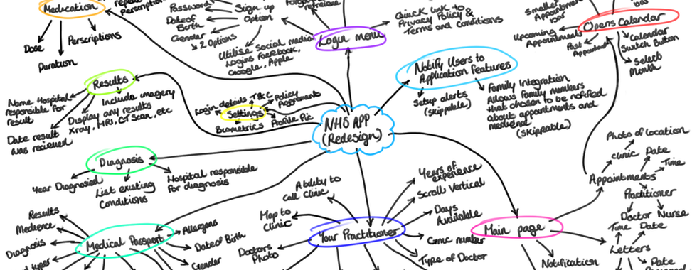
I kicked off the project by analysising the 30 user reviews located on the Google Play Store to uncover their biggest goals and pain points, which inspired three core personas “Busy Parent,” “Chronic Care Patient,” and “Digital Novice” to laser-focus my features. From there, I sketched low-fidelity flows in Photoshop, flattened deep menu trees in Figma, and distilled the app down to four primary tabs, Home, Your Practitioner, Medical Passport and Settings refining each iteration with rapid peer feedback. Finally, I married these insights to the NHS Service Manual, customising button states, input fields, card layouts, and our calendar picker to ensure rock-solid visual and interaction consistency.
Key Insights & Patterns
Key Insights | User Review (Google PlayStore) | Patterns | Design Implication |
Functionality Gaps | "Messages say 26 unread forever... COVID passport inaccessible." | Messaging counter stuck; prescriptions split across disparate screens. | Repair broken endpoints, consolidate related tasks, and add graceful error recovery. |
Performance & Stability | "Spinning wheel that never stops." | The app freezes during ID upload or record fetch, and forced updates never complete. | Prioritise on-device vaildation, add offline states, and expand QA coverage around network edge cases. |
Usability / UI | "Looks like a committee designed it like a bad web wrapper." | Navigation is unintuitive; key flows (e.g., appointments) are hidden behind secondary apps. | Re-architect th e information hierarchy and adopt native mobile patterns. |
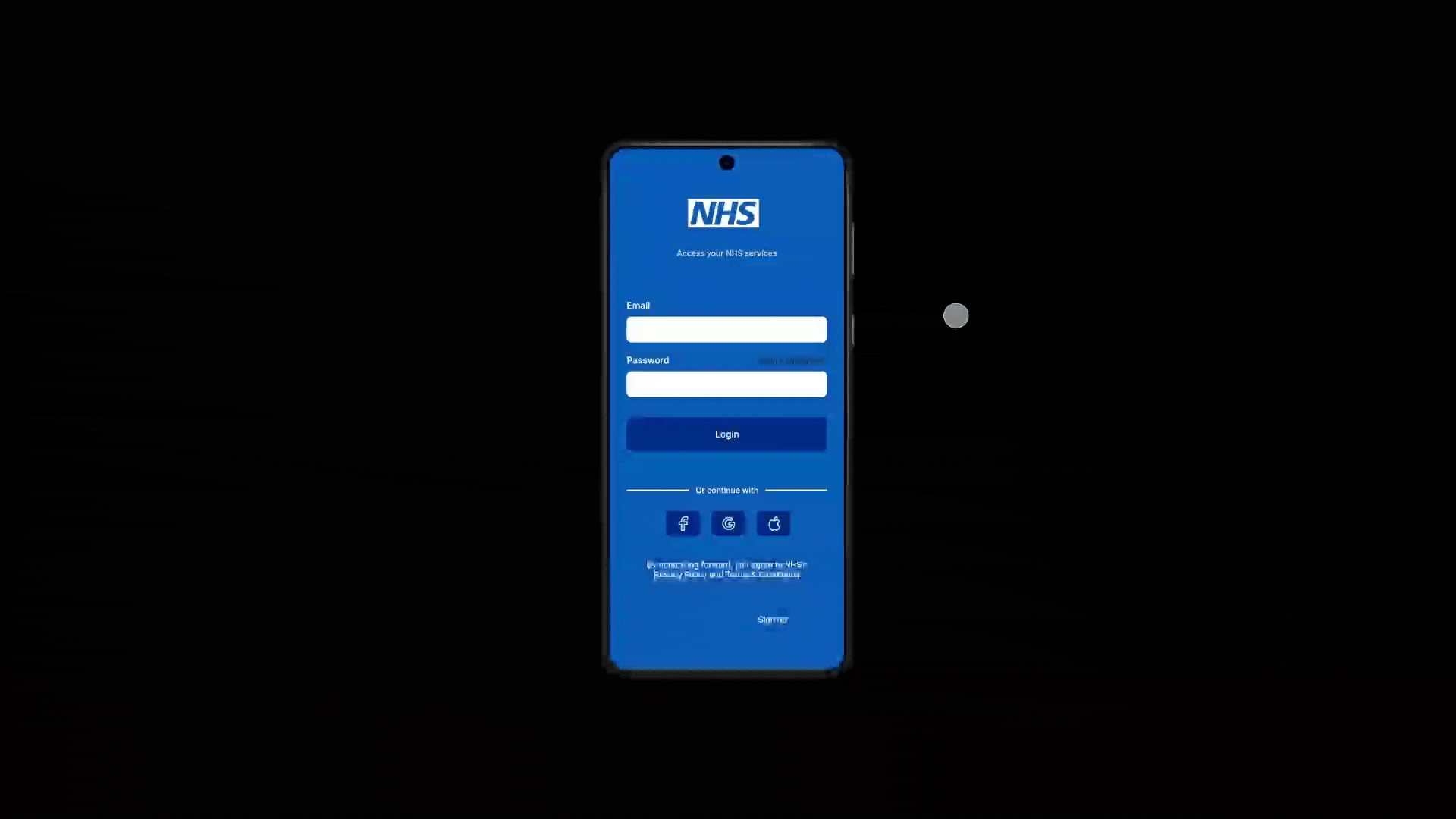
Login & Authentication (most critical) | "User-hostile login - Junk app... enter email, password and solve a captcha every time." | Multi-step ID checks (including photo, video, and facial recognition) often fail or freeze. Frequent forced log-outs; passwords forgotten by the system. | Radically simplify authentication and support modern biometric pass-through (Face ID / Android BiometricPrompt). |
*Estimated from 30 reviews retrieved from the Google Play store.
Competitor Research

Apple Health
Apple Health excels at unifying Apple Watch data, third-party data, and manual entry into a handsome, centralised dashboard. Dynamic graphs and familiar iOS conventions make advanced health statistics instantly actionable, and bullet-proof privacy controls keep users firmly in charge of their data. It stops at transactional tasks like scheduling appointments or refilling prescriptions. For the NHS app redesign, let's take its clean design and native feel, then build on top active service flows and open, user-first privacy controls.

MyChart
MyChart is a Swiss Army knife of patient portals: test results, appointment booking, secure messaging, prescription refill, and complete record access all in one place. Deep integrations with healthcare systems give users actual ownership over their data, but the sheer breadth can be overwhelming and vary wildly by provider. The NHS redesign should take MyChart's back-end integration, flatten the hierarchy, and simplify navigation for a cleaner, more consistent experience.

Babylon Health
Babylon dazzles with AI-powered symptom checking and on-demand video/text consultations, all wrapped in a friendly, modern UI. It makes care instantaneous, though AI errors erode trust and never match the same level of human empathy. In the NHS app, agile AI helpers might smooth out knotty workflows, provided we maintain crystal-clear signposting and readily available human support.

Ada Health
Ada's symptom-checking chatbot walks users through conversational prompts and personalised next-step guidance. It is medically solid and streamlined, excelling as a triage instrument but not providing more extensive patient management functionality. We can adopt Ada's chat-first approach to onboarding, registration, or in-app support, then transfer the user to human personnel when the conversation calls for a human touch.

Patient Access
Patient Access specialises in GP essentials, appointment booking, repeat prescriptions, and record viewing through a stunningly minimalist interface that garners rave reviews. Its laser-like concentration drives reliability but excludes national NHS services like organ donation and national public health initiatives. The NHS app should match Patient Access's ease and speed of use for everyday GP services, yet establish a separate section for broader, national services.
Visual Design & Components
Colour & Typography: Retained NHS Blue for primary actions & highlights; employed Inter for body text and headings, where legibility was maximised.
Iconography & Imagery: Utilised icons from Flaticon for menu navigation, notifications, voice controls and confirmations to share the same visual identity. Employed patient-centric imagery on onboarding screens to establish trust.
Component Library: Constructed reusable cards, form controls, and modals in Figma. Every component has accessibility and responsive behaviours for mobile devices.

Prototyping & Interaction
High-Fidelity Prototype: Designed interactive flows in Figma, emphasising tap states, calendar selection, and notification messages. Transitions (slide-up panels, fade-ins) reflect state changes without overwhelming the user.
Usability Testing: Completed two rounds of moderated testing with six participants. Most significant findings:
Calendar picker needed "Today" quick-select.
Confirmation message for successful appointment booking would boost user confidence.
Profile section labels required more assertive affordance (e.g., "Edit Details" vs. "Icon").
Reflection & Next Steps
Strengths
Implemented a natural IA reduced core task steps by 40%.
Integrated NHS brand guidelines with modern mobile trends.
Built a robust, reusable component library for the future.
Room for Improvement
Animation Tuning: Include micro-interactions (button ripple, input field shake) for better feedback.
Extended Testing: Engage more visually impaired users to stress-test contrast and screen-reader flows.
Cross-Platform Consistency: Deploy designs for Android Material Theming and iOS Human Interface Guidelines.
Final Thoughts
This re-design of the NHS Mobile App has been a valuable learning experience for developing public-sector UX, inclusive interfaces, and large-scale component systems. With user-driven insight and brand commitment combined, I've demonstrated how care and empathy could re-form a life-saving health tool.
LINK TO PROJECT: https://www.figma.com/proto/hZxf3VuyEONvtfJnoRqzyK/-Redesign--NHS-App?t=Ux1Uul8pvgB73um5-1


Comments