Fan-Made User Interface Concept for Marathon
- Nov 24, 2025
- 4 min read
Updated: Apr 21


Introduction to the Project
This project showcases my skills in user interface design. I aimed to create a unique interface inspired by various games while maintaining a distinct identity. The goal was to blend technical proficiency with artistic vision.
Start Screen
The start screen design was guided by the clean, minimalistic aesthetic found in Overwatch 2. The objective was to create a modern and energetic entry point that foreshadows the gameplay. I focused on ease of navigation while establishing a polished first impression.
Main Menu
The main menu retained the overall structure of the publicly available Marathon Alpha 0.5.0.0 layout but introduced framed typographic elements to transform text into well-defined, interactive buttons. The background environment is a 3D scene titled UESC Marathon, created by Alex Murphy (https://www.artstation.com/artwork/Aln2GW). This scene offered a strong thematic foundation while emphasising depth and atmosphere.

Loadout
To distinguish the loadout experience from typical extraction shooters, I adopted the visual logic of Destiny 2’s loadout interface. This allowed for a more elegant presentation of equipment and abilities. I also used Destiny 2’s ability system as inspiration for demonstrating how Runner shells could host interchangeable abilities. This helps visualise a flexible and player-driven customisation model.


Factions
The faction screen preserved the structural layout of the Alpha 0.5.0.0 but enhanced visual vibrancy to create a more engaging presentation. Warframe’s faction reputation system informed a redesigned progression loop. Aligning with one faction would reduce standing with another, temporarily restricting access to certain rewards. This system introduces meaningful player choices while supporting long-term replayability.
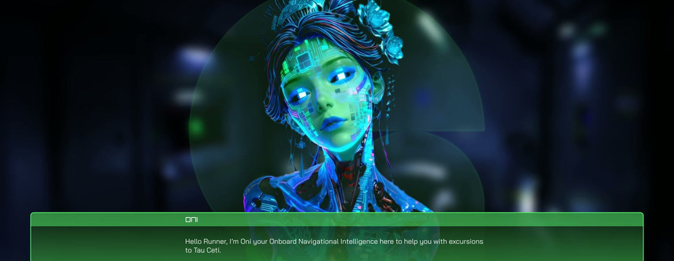
For the Oni faction, an AI-generated Pinterest image served as the illustration. While an early version included a custom Durandal video, audio limitations led to generating a revised, aesthetically coherent Oni instead.


Database
The Database leveraged layout principles from Destiny 2’s Triumphs interface and The Division 2’s collectibles menu to establish a clear, hierarchical structure. Alien entity renders were developed using the Inktober illustrations of Garret Post (https://www.artstation.com/artwork/kDel2K) as a stylistic and anatomical reference. This resulted in grounded, high-fidelity creature concepts.


Black Market
The Black Market was introduced as a systemic solution to the faction lockout mechanic created earlier in the design. Drawing inspiration from the player-driven economy seen in Off the Grid, this market provides alternative paths for acquiring items from factions where a player’s standing is temporarily reduced. This reinforces player agency and mitigates the frustration of hard-locking rewards.


Run Summary
The Run Summary drew influence from Warframe’s end-of-mission presentation. The concept centered around having a representative figure similar to the Lotus from each faction. This character would encourage, critique, or comment on the player’s performance throughout various stages of a match. This adds personality, tone, and narrative texture to the post-match experience.
Conclusion
This project represents a blend of my passion for game design and user interface development. By drawing inspiration from various successful games, I aimed to create a unique experience that resonates with players. The design choices reflect a commitment to clarity and engagement, ensuring that users can navigate the interface effortlessly.
Reference Links
Arena Hub. (2025, April 23). Full Marathon Alpha Menu Walkthrough Video]. YouTube. [https://www.youtube.com/watch?v=YQIP_VFilWQ
Bonn. (2024, July 25). Marathon | Battlepass, Black Market, agents Video]. YouTube. [https://www.youtube.com/watch?v=3Nlrf3Xajis
Cheese Forever. (2025, April 19). Marathon Alpha title screen and music Video]. YouTube. [https://www.youtube.com/watch?v=fQLx2zGN1sc
Eastn7. (2024, November 6). Off The Grid Marketplace Explained, Hexes Breakdown, and What to do with GUNZ You’ve Earned. Video]. YouTube. [https://www.youtube.com/watch?v=slzLvDWQCoQ
Forbes: Marathon привела Bungie к кризису. (2025, May 20). Shazoo. https://shazoo.ru/2025/05/20/167960/forbes-marathon-privel-bungie-k-krizisu
Gameshastra Team. (2025a, August). Marathon M5 [Online forum post]. ArtStation. https://www.artstation.com/artwork/EzW12e
Gameshastra Team. (2025b, August). Marathon M77 [Online forum post]. ArtStation. https://www.artstation.com/artwork/nJPNv6
God, G. (2025, August 25). Female Samurai. Pinterest. https://pin.it/595SjZX1B
Interface In Game. (2020a, November 22). Mission success summary - Warframe | Interface In Game. Interface in Game. https://interfaceingame.com/screenshots/warframe-mission-success-summary/
Interface In Game. (2020b, December 8). Character - Destiny 2 | Interface in Game. Interface In Game. https://interfaceingame.com/screenshots/destiny-2-character/
Interface In Game. (2020c, December 11). Bestiary - The Witcher 3: Wild Hunt | Interface in game. Interface In Game. https://interfaceingame.com/screenshots/the-witcher-3-wild-hunt-bestiary-2/
Marathon. (n.d.). Arne Niklas Jansson, No Infringement Intended. https://androidarts.com/marathon/marathon.htm
Marathon Game News! (2025, June 29). -Black Market has materials exchange to trade higher tier ones for lower tier -Map legend more clearly shows where things like anomalies & bosses are -New sniper (V99 channel rifle), takes volt cell ammo -Resurrection timers MUCH longer -New medic runner. https://x.com/MarathonBungie/status/1939137306725883910
Marathon Intel. (2025, April 23). Bungie’s Marathon – ONI Intro & CyberAcme AI Intro (all cutscenes) Video]. YouTube. [https://www.youtube.com/watch?v=Sw_PdO-W9bY
Murphy, A. (2023). UESC Marathon [Online forum post]. ArtStation. https://www.artstation.com/artwork/Aln2GW
Neite_yt. (2024). Artifacts [Online forum post]. Reddit. https://www.reddit.com/r/Marathon/comments/1gvq2kk/artifacts/
nervousmelon. (2020). Stasis UI (With Aspect) [Online forum post]. Reddit. https://www.reddit.com/r/destiny2/comments/ikne59/stasis_ui_with_aspect/
pokpak. (n.d.). Pixel Art Fictional Planet Pro PNG [Online forum post]. Vecteezy. https://www.vecteezy.com/png/13519075-pixel-art-fictional-planet
Post, G. (2020). Inktober Week 3 [Online forum post]. ArtStation. https://www.artstation.com/artwork/kDel2K
Robot100. (n.d.). Skull pixel art. 8 bit skeleton head. pixelated vector illustration. [Online forum post]. Dreamstime. https://www.dreamstime.com/skull-pixel-art-bit-skeleton-head-pixelated-vector-illustration-skull-pixel-art-bit-skeleton-head-pixelated-vector-illustration-image259119803
Runners HQ. (2025, April 23). 50 MINS of WORKING FOR TRAXUS - MARATHON ALPHA GAMEPLAY (No commentary) Video]. YouTube. [https://www.youtube.com/watch?v=O1WTRcT3SmU
Shearon, A., & Orr, J. (2025, October 17). Marathon: Everything we know about Bungie's sci-fi extraction shooter. PC Gamer. https://www.pcgamer.com/games/fps/marathon-guide/
shroud. (2025a, April 25). We tryin MARATHON Video]. YouTube. [https://www.youtube.com/watch?v=ut52CJ-GinU
TenielX. (2024). New loading screen in latest patch [Online forum post]. Reddit. https://www.reddit.com/r/Overwatch/comments/1fj69wt/new_loading_screen_in_latest_patch/
Wood, A. (2025, April 12). After playing Marathon for 8 hours, I don't think Bungie's extraction shooter will be the next Helldivers 2… GamesRadar+. https://www.gamesradar.com/games/fps/marathon-hands-on-preview/
Zanezooked. (2024, June 17). Lh’owon - Bungie Marathon 2: Durandal & Marathon Infinity Remix Video]. YouTube. [https://www.youtube.com/watch?v=_MPDu8DWY5Q
Additional inspirations sourced from Destiny 2, Overwatch 2, Warframe, Doom Eternal, The Division 2, and publicly available footage of Marathon Alpha 0.5.0.0.