Redesigning the Steam Desktop Client: A UX Journey
- Oct 14, 2025
- 4 min read
Updated: Apr 21


Overview of the Redesign Process
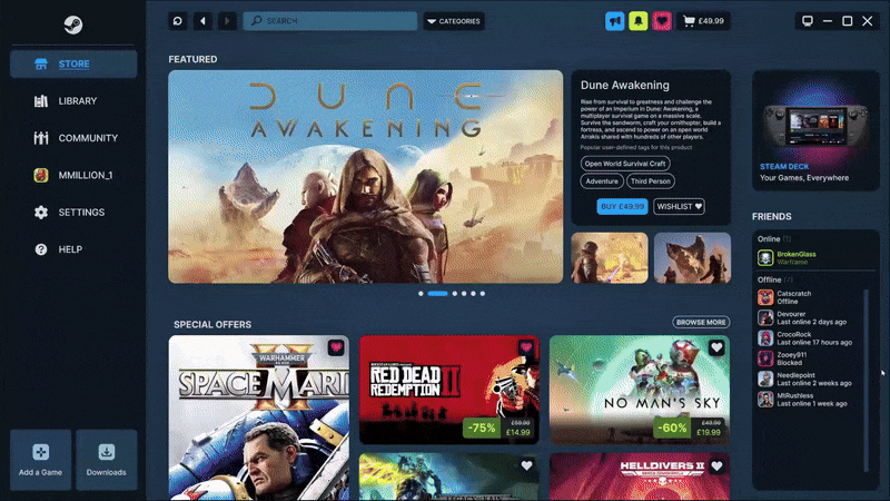
In just five days, I conceptualised and designed a complete redesign of the Steam desktop client. Wearing both the UX designer and researcher hats, I focused on improving its look, feel, and navigation. Armed with Figma, I transformed Steam's chaotic interface into a clean, intuitive design. This new interface appeals to hardcore gamers while remaining fresh and engaging for newcomers. Although this was a conceptual exercise and not affiliated with Valve, it highlights the potential of focused research and rapid prototyping to rejuvenate a classic application.

Conceptual Foundation of the Redesign
I anchored the redesign in three core principles:
Modern Visual Language: I drew inspiration from contemporary UI trends, incorporating clean typography, simplified iconography, and balanced negative space. This approach replaces Steam’s outdated panels and menus.
User-First Navigation: I prioritised the most-used features—library, store, community, and settings—by surfacing them through a streamlined, consistent sidebar.
Personalised Discovery: I leveraged modular dashboard cards that adapt to user behaviour. This feature offers tailored game recommendations and quick-access shortcuts.
To ground these principles, I assembled a reference matrix that included Epic Games Store, GOG Galaxy, and Xbox Game Pass. This helped me distil best practices in layout, filtering, and social integration.

Research & Workflow: Understanding User Needs
I began by conducting a comprehensive heuristic evaluation of the existing client. I noted system feedback, consistency, and areas where error prevention could be improved. Following this, I conducted in-depth interviews with five diverse Steam users. These interviews revealed frustrations related to daily gameplay discovery, cluttered homepages, hidden community hubs, and complex settings.
A benchmark evaluation of competing solutions sharpened my understanding of industry standards. This allowed me to focus on three high-impact areas: home dashboard, library browsing, and community feed. Armed with this research, I created low-fidelity wireframes in Photoshop. I then guerrilla tested these wireframes in Figma, iterating flows into clean, interactive prototypes.
Competitor Research: Learning from Others
 | Epic Games StoreEpic's store greets you with big, full-bleed headers promoting weekly free games and temporary exclusives. This establishes a sense of immediacy that encourages return visits. Its tidy sidebar and minimalist launcher yield lightning-fast load times. However, library management remains basic, and social features are an afterthought. By borrowing Epic's "Free This Week" carousel and condensing submenus into sweeping, icon-based categories, Steam can trigger repeat engagement and improve discovery without sacrificing depth. |
 | GOG GalaxyGOG Galaxy honours user autonomy with a DRM-free ethos. It serves as a cross-library aggregator, pulling games from all launchers into a stunningly filterable interface. Its powerful tags, installed-status toggles, and customisable shelves enrich gamers' experiences. However, its multi-account setup and optional skins may confuse newcomers. Steam could learn from GOG's filter sidebar, which is always available and immediately accessible. This allows players to view only installed, favourite, or non-Steam games while maintaining a unified core appearance. |
 | Microsoft Store | XboxMicrosoft's app brings PC and console together under one roof. Game Pass is front and centre, with automatic syncing of saves, achievements, and party invites between consoles. However, its hybrid media library and occasionally slow performance dilute the experience. Merging a Steam "Pass" pane that focuses on subscription benefits, with cloud-sync icons on library thumbnails and a clean social overlay for quick-join games, would blend Xbox's cross-platform magic with Steam's performance power. |
 | Ubisoft Connect | BetaUbisoft Connect draws players into live events, timed challenges, and a single rewards currency across all Ubisoft titles. This promotes habitual checking in. However, its menus, stores, news, rewards, and stats may resemble a maze. The preponderance of microtransactions can dominate gameplay at times. Steam may capitalise on Ubisoft's event-based engagement by creating a "Live Events" hub and an XP-nodding badge system for seasonal community goals, all presented in a flatter, more streamlined navigation. |
 | EA AppEA's redesigned launcher simplifies playflows with big "Play" buttons and a news feed touting early access and Insider drops. EA Play subscription perks take the form of trial-hour icons for owned games. However, the feed tends to be full of sales, and the grid-predominant library begs for richer sorting features. By enhancing its "News & Events" sidebar with friends' achievements and upcoming DLC, and by showing trial-access badges on Steam cards, Steam can achieve the perfect balance between personal news and publisher content. |
Visual Design & Components: Crafting an Engaging Interface
Colour & Typography: I retained Steam’s dark-blue palette but introduced subtle gradients. Increased contrast enhances legibility, and I standardised the font hierarchy for clarity.
Iconography & Components: I developed a minimal icon set for primary actions such as play, download, and chat. Additionally, I built reusable Figma components to ensure consistency throughout the interface.
Navigation Structure: I replaced the multi-level top navigation with a persistent, collapsible sidebar. This sidebar groups Store, Library, Community, and Settings, providing clear visual affordances.

Prototyping & Interaction: Testing with Users
Two moderated tests with eight participants generated high-quality feedback. In the first round, users loved the sidebar's minimalist look but requested more explicit labels between the Store and Community tabs. In the second round, with high-fidelity prototypes, the new dashboard received strong consensus on relevance and navigability. Testers suggested broadening the search input field and adding subtle hover states to library filters. This iterative process demonstrated the power of rapid feedback loops: small changes yielded significant improvements in clarity and user satisfaction.
Reflection & Next Steps: Looking Ahead
This sprint project highlighted the importance of maintaining a tightly defined scope and conducting regular checks. In the future, I plan to test more thoroughly across a wider sample of older players and those with accessibility needs. This will ensure the redesign meets the diverse requirements of Steam's player base. I also intend to develop Figma elements into a living style guide or Storybook library, bridging the gap between design and development. Finally, integrating analytics will play a crucial role in monitoring real-world usage of future interfaces.
Areas for Improvement:
Accessibility: Conduct contrast audits and keyboard-only navigation tests to ensure compliance with WCAG standards.
Data-Driven Insights: Incorporate quantitative metrics, such as clickstream analysis, to prioritise features based on actual usage.
Final Thoughts: A Journey of Growth
This Steam redesign journey has sharpened my ability to drive a UX initiative from discovery through validation within a condensed timeframe. By balancing innovation with familiarity, the project illustrates how incremental, user-centred improvements can revitalise a beloved platform without sacrificing its essence.
LINK TO PROJECT: https://www.figma.com/proto/Xu5k8u1ATjpFq2hvhRWoXc/Steam_Redesign?node-id=0-1&t=aywqfNahWqCnxJeb-1


![[TONY TSENG] EXPLOSIVE KNIFE](https://static.wixstatic.com/media/d1de24_96cbf2c2adff4517a399fa2746177da2~mv2.png/v1/fill/w_980,h_551,al_c,q_90,usm_0.66_1.00_0.01,enc_avif,quality_auto/d1de24_96cbf2c2adff4517a399fa2746177da2~mv2.png)


Comments