DESTINY 3 DIRECTOR UI - PERSONAL PROJECT
- Feb 19
- 10 min read
Updated: Apr 21


In truth, I left Destiny 2 after playing Lightfall.
I didn’t leave because I didn’t love the universe; rather, I left because of the removal of paid content, sunsetting, fighting the same four races since 2014 and microtransactions. I still have fond memories of being a part of the Destiny 1 Closed Alpha, to theory-crafting with friends, and playing my first raid. I have kept up-to-date on content updates and lore by watching content creators like xHOUNDISHx, Evade, LUCKYY 10P, Aztecross, and My name is Byf.
When they changed the Director from the Solar-System map we were used to, to a flat grid like Netflix has, it felt like we were losing a part of the game’s identity. I couldn’t just be mad at this being a Designer; I had to understand what was wrong with it and how to create a solution.
So I bought all the new DLC on sale, came back to play on Steam, and began to create my own version of a Destiny 3 Director, which would be a fan-made, non-commercial design focused on navigation, legibility, and relating to the universe emotionally.
Project framing and disclaimer
This project is:
This is a concept for an independently created UI project, and is not associated with or endorsed by Bungie.
In creating this UI, I used both Figma and Affinity Studio, with every piece of UI either being hand-drawn or generated through image tracing.
All of the UI elements were developed without AI assistance except for the alien entity 'Three'; that asset was generated through an AI image engine, and then significantly modified in Affinity Studio.
All trademarks, game titles, and related assets belong to their respective owners. No proprietary or unreleased Bungie materials were used at any point.
My goal is not to “fix” Destiny, but to show how I would develop a galaxy map in Destiny 3 and hopefully spark a conversation with both the community and developers who care about where the franchise goes next.
Design problem: why the old Director mattered
The original Destiny Solar System provided a visual representation of a location as opposed to just selecting the level; it provided an indication of progression (represented by new nodes, expansions and seasonal activities over time); and it created a balance between being visually pleasing and having clear information regarding location.
The newer Netflix‑style Director gains some information density, but everything now exists in a flat carousel that’s harder to recall. The director loses its sense of wonder as the cosmos collapses into a content list, a problem already identified in a talk conducted by David Candland at GDC between 43:00-49:00 called “Tenacious Design and The Interface of Destiny” (GDC Festival of Gaming, 2016).
(GDC Festival of Gaming, 2016)
I set out to create a Director that could scale to a Destiny 3 sized universe, keep the galactic feel of the original, support modern needs like difficulty tiers, matchmade activities and seasonal hubs that feel great on both controller and mouse/keyboard. To get there, I drew heavily from Warframe’s Star Chart while staying firmly grounded to Destiny’s visual identity.
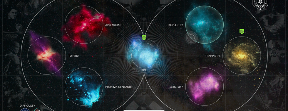
The Galaxy Map: making the Milky Way feel like home
A Milky Way galaxy map would allow Destiny to become a galactic travelling saga, providing a pure, simple and readable overview of many of the major systems in the universe including Sol, TRAPPIST-1, TOI-700, Kepler-62, Proxima Centauri, Gliese 357, and A2G Aridian. Each star system would group content into one easy to find place, waypointing storyline missions, location of all the new expansions, and also where all your friends are.
This map creates a radial arrangement with Sol being at the centre and all of the systems radiating out from the centre of the galaxy, this represents Destiny's want to focus on Earth and the Traveller, however also gives all of the new systems their own weight and presence. Each system has a nebula effect that encompasses the colour assigned to that individual star systems.
The circular boundaries outlining each nebula indicate that clicking any point in a system will direct you to that system’s local map. Theres a small difficulty cluster in the bottom left hand corner to change the difficulty of the game across the board, akin to Warframes steel path switch. The galaxy map is intended to emphasis the players emotional connection and immersion instead of scrolling through a content library.

Once you select a star system, the UI shifts from galactic map to local star system.
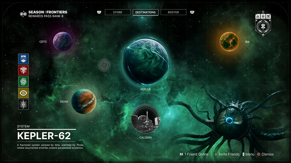
Kepler-62
I envision Kepler-62 as a time-warped, broken system being observed by a fourth-dimensional being known as “Three”. Kepler is the main point of interest with the planets Ceto, Dione and Bia orbiting it creating a visual hierarchy. The names of the planets are references to Greek deities suppose to the original naming conventions 62a, 62b,62c, etc (Wikipedia contributors, 2026).

(Wikipedia contributors, 2026)
Three is positioned in the lower right of the screen, implying an encounter or patrol location, furthering the theme of being "watched" by Three. An activity bar is located on the left side, which is made up of many familiar sigils strikes, crucible, gambit, trials of osiris and raids/dungeons, giving immediate access to core activities. The layout answers three major UX questions:
What you can do here (planet nodes and social hubs like Caldera).
Who is involved (The Nine, among other factions)
What it feels like (a mood of cosmic unease with Three watching).
Trappist-1
I imagined TRAPPIST-1 as a hardened Cabal stronghold where Empress Caiatl would rally her fleets for war, and every design decision reinforces that militarised identity: The fractured planet of Torobatl dominates the map as the central battleground, with Xivu Arath’s Throne World hanging beneath visually tethered to suggest it’s the missing half of Torobatl.
The visual choice for Torobatl was inspired by the concept art of Xivu Arath shrouding her surrounding in darkness, my thoughts are that she pulled the environment in her throne world. However, Xivu has now been separated from her throne world by Eris so I determined that Xivu’s connection would have to be reestablished to allow Xivu to release her hold over Torobatl, which would start a war. This would prehaps be a good starting point for Destiny 3.

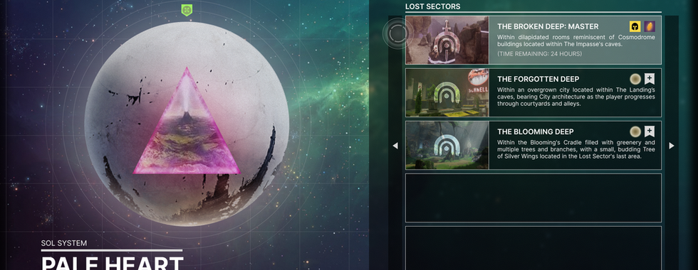
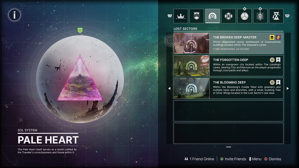
Sol

(Bungie, 2024)
Sol serves to provide an emotional centre for all of Destiny’s players, with The Pale Heart being at the centre of all that. With the Pale Heart I would suggest utilising the location to create procedural content using tile sets from new locations similar to Warframe. Hand crafted experiences are great, however, randomisation of the activity and encounters could minimise player burnout. To explain the procedural nature of the Pale Heart I suggest anything the guardians and ghosts observe can manifest within the traveller.

Activity navigation
When a player selects a location or area of interest, this takes them to a quest view which intentionally associates the progression of specific acitivities to the area itself similar to Warframes star chart. The left portion of the screen contains a single large, minimalist rendering of the location. On the right side of the screen there is a readable listing of available missions associated with the location, with the names of each listed mission (Transmigration, Temptation, Exegesis, Requiem, and Ascent) clear and easily scannable. A quest, strike, exotic mission, raid, etc would be listed when it becomes available. This removes currently abstract menus, helping players associate the locations with activities.
In addition to this, the activities structure (strikes, lost sectors, patrol events, exotic missions, raids, and replayable quests) are completely separate from campaign missions so that new players do not lose track of their story making navigation through the campaign quick and easy (click & go!).


Production
In Figma, I designed and prototyped the layouts of different visual elements, layouts and reusable assets. I also cleaned up the logos and icons after vectorising them in Affinity Studio by removing any excess noise and making sure that silhouettes were as sharp as possible before I composed the finished render. These assets will make it much easier to create future projects and improvements to the user interface, since they can be easily re-themed.
I then used Affinity Studio for the visual polish of the user interface by editing nebulae and planets. All of the UI elements that I created (icons, frames, rings and indicators) are all vector-based, which means they will remain razor-sharp even when viewed on a 4K display and can easily be re-themed.
The only piece of AI-generated content in this project is the entity "Three." Initially created with the help of AI, the original concept received a considerable amount of manual editing and repainting to produce a realistic render of Three.
Interaction thinking
Although these are static shots, every screen was designed with focus, movement and animation in mind:
Radial selections for the individual star systems would have a subtly tilt or parallax towards the cursor or stick input akin to the existing animation in the game.
I envision the transition from the galaxy map to the local selected star system to be a smooth fly‑through rather than hard cuts, whereby the nebula on the galaxy map enlarges and unveils the selected system.
Social prompts and difficulty toggles should stay anchored to the corners, preventing friction when players navigate through the galaxy.
Final message
The inspiration behind this project is similar to all those lore videos and build guides we stay up to watch at 2:00 AM, by everyone who truly cares about this universe, even when we are frustrated with the game's state. Playing the game again was nostalgic, and I believe Destiny can still continue its success. The framework is there, and luckily, Bungie has a lot of skilled staff. If you would like to give any feedback or project requests, please leave a comment below.


References:
⚜️ℝ𝕠𝕄𝕒ℕ⚜️. (n.d.). Balck Hole. Pinterest. https://uk.pinterest.com/pin/667588344805409289/
AGU News. (2016, May 17). Europa’s ocean may have an Earthlike chemical balance. AGU Newsroom. https://news.agu.org/press-release/europas-ocean-may-have-an-earthlike-chemical-balance/
Ali, Z. (2023, August 7). 13 Major Updates in Destiny 2 Season 22 Players Should Look Forward to. The Game Post. https://thegamepost.com/13-major-updates-destiny-2-season-22/
Ali, Z. (2024a, August 22). Destiny 2 Echoes Act 3 promises 'One of the biggest' exotic missions, coming soon. The Game Post. https://thegamepost.com/destiny-2-echoes-act-3-biggest-exotic-mission-soon/
Ali, Z. (2024b, September 5). NetEase's Destiny Rising Mobile Game Appears To Be An "MMORPG" with "High. The Game Post. https://thegamepost.com/netease-destiny-rising-game-mmorpg-high-standards/
Anderson, R. (2023). Destiny’s Grimoire Anthology Book v [Concept Art]. ArtStation. https://www.artstation.com/artwork/498k4k
Apsey, E. (2023, February 28). Destiny 2 Pouka - lore and origin of the mysterious creature. The Loadout. https://www.theloadout.com/destiny-2/pouka
Bardavelidze, T. (2020). Pyramids of Darkness [Digital 3D]. ArtStation. https://www.artstation.com/artwork/lxxP1J
Barton, T. (2018). 4K Ultra HD Sci-Fi Green Nebula Starfield [Wallpaper]. alphacoders.
Bea, R. (2025, July 16). ‘Destiny 2’ features a familiar villain’s voice in a strange place, but not for long. Inverse. https://www.inverse.com/gaming/destiny-2-recast-ikora-ray-voice-actor-sagaftra
Bellbrook, D. (n.d.). Destiny 2: Leviathan [Concept Art]. ArtStation. https://www.artstation.com/artwork/q5vwa
Bungie (2024) Destiny 2: Final Shape Director [Video game]. Bungie
Burgar, C. (2024, October 9). How to craft and use tonics in Destiny 2: Revenant. TheGamer. https://www.thegamer.com/destiny-2-revenant-how-to-craft-tonics/
Chalk, A. (2018, April 24). Destiny 2: Warmind stream reveals Ana Bray, new Hive horde mode, and season 3 changes. PC Gamer. https://www.pcgamer.com/destiny-2-warmind-stream-reveals-ana-bray-new-hive-horde-mode-and-season-3-changes/
Choi, C. Q., & Harvey, A. (2023, April 12). Planet Earth: Everything you need to know. Space. https://www.space.com/54-earth-history-composition-and-atmosphere.html
Clark, T. (2019, August 21). 7 questions that remain unanswered by Luke Smith's Destiny 2 mega-blog. PC Gamer. https://www.pcgamer.com/7-questions-that-remain-unanswered-by-luke-smiths-destiny-2-mega-blog/
Client challenge. (n.d.-a). https://destiny.fandom.com/wiki/Mithrax
Client challenge. (n.d.-b). https://destiny.fandom.com/wiki/Mithrax
Cruz, A. (2021). Destiny 2: Beyond Light - Clovis Bray AI [Digital 3D]. ArtStation. https://www.artstation.com/artwork/xJvyrE
Davis, I. (n.d.). Destiny 2: The Edge of Fate - The Singularity [Digital 3D]. ArtStation. https://www.artstation.com/artwork/0lqKOK
Destiny 2: Renegades Ultimate Edition Upgrade on Steam. (n.d.). https://store.steampowered.com/app/3700550/Destiny_2_Renegades_Ultimate_Edition_Upgrade/
Destiny Bulletin. (n.d.). why is this in the game at this point. X. https://x.com/DestinyBulletn/status/1749100486165496046
Destiny review. (2015, February 9). Eurogamer.net. https://www.eurogamer.net/destiny-review
Destinypedia. (2025a, April 5). The Blooming Deep - Destinypedia, the Destiny wiki. Destinypedia. https://www.destinypedia.com/The_Blooming_Deep
Destinypedia. (2025b, August 22). The Forgotten Deep - Destinypedia, the Destiny wiki. Destinypedia. https://www.destinypedia.com/The_Forgotten_Deep
Destinypedia. (2025c, December 30). Kepler - Destinypedia, the Destiny wiki. Destinypedia. https://www.destinypedia.com/Kepler
Destinypedia. (2026a, January 24). Riven of a Thousand Voices - Destinypedia, the Destiny wiki. Destinypedia. https://www.destinypedia.com/Riven_of_a_Thousand_Voices
Destinypedia. (2026b, January 28). Lodi - Destinypedia, the Destiny wiki. Destinypedia. https://www.destinypedia.com/Lodi
Destinypedia. (2026c, February 4). The Pale Heart - Destinypedia, the Destiny wiki. Destinypedia. https://www.destinypedia.com/The_Pale_Heart
“Discover the Mind-Bending Wonders of the Universe: 10 Mind-Blowing Facts about Space You need to know!” (n.d.). Futurism. https://vocal.media/futurism/discover-the-mind-bending-wonders-of-the-universe-10-mind-blowing-facts-about-space-you-need-to-know
Disney [Star Wars]. (n.d.). Lola Syua. starwars.com. https://www.starwars.com/databank/lola-sayu
Espinoza, L. (2025, August 17). Carina Nebula Details: Great Clouds - NASA Science. NASA Science. https://science.nasa.gov/asset/hubble/carina-nebula-details-great-clouds/
Galaxy PNG PNG transparent download - Bright Galaxy Stars - Free Transparent PNG download - PNGKey. (n.d.). PNGkey.com. https://www.pngkey.com/detail/u2e6y3y3q8t4r5i1_galaxy-png-png-transparent-download-bright-galaxy-stars/
GDC Festival of Gaming. (2016, June 17). Destiny’s tenacious design and interface [Video]. YouTube. https://www.youtube.com/watch?v=zp4NZ8i80QI
Gilliam, R. (2019, December 23). Destiny 2’s Saint-14 laughs at you if you wear his helmet. Polygon. https://www.polygon.com/2019/12/23/21035760/destiny-2-helm-of-saint-14-interaction-tower-joke-line/
Haberkorn, T. (2025, December 2). Happy Destiny 2: Renegades release day. . .to those that celebrate. https://www.linkedin.com/posts/toddhaberkorn_haberdrifter-starwars-destiny2-activity-7401698095631425536-CfEQ/
Holt, K. (n.d.). Planet. Pinterest. https://uk.pinterest.com/pin/667588344805409701/
Instagram. (n.d.). https://www.instagram.com/p/C84z6JPNWOj/
Lemaire, R. (2025). Helldivers II - Hive Worlds / Bugs Hive [Digital 3D]. ArtStation. https://www.artstation.com/artwork/980QvQ
Les Gets. (2025, June 3). Neptune – Planet Trail - les gets. https://www.lesgets.com/en/neptune-sentier-des-planetes/
M RIZAL. (n.d.). Galaxy Overlay Space Free PNG. Vecteezy. https://www.vecteezy.com/png/26548551-galaxy-overlay-space
Marsi. (n.d.). Planet. Pinterest. https://uk.pinterest.com/pin/667588344805409700/
Mayflower. (n.d.). A close up of a painting of a spiral with a sky background Generative AI [Generative AI]. Freep!K; Free. https://www.freepik.com/premium-ai-image/close-up-painting-spiral-with-sky-background-generative-ai_58454728.htm
Mesaros, C. (2025). Destiny 2 - The Final Shape: “Liminality” Strike (Arenas) [Digital 3D]. ArtStation. https://www.artstation.com/artwork/dK2zrW
Nebula – 2710ΓÇÅx1694 (16×10). (2016, January 20). Awesome Wallpapers. https://awesomewallpapersblog.com/2016/01/19/spacefantasy-wallpaper-set-89/nebula-2710%CE%B3cax1694-16x10/
nicepng. (n.d.). Space Transparent PNG Clip Royalty Free Download - Yellow Orange Nebula Transparent PNG. Nicepng. https://www.nicepng.com/ourpic/u2q8a9u2r5r5i1y3_space-transparent-png-clip-royalty-free-download-yellow/
Northcutt, B. (2018). Solo - A Star Wars Story 2018 (Disney/LucasFilm) [Concept Art]. ArtStation. https://www.artstation.com/artwork/bAaLk
Novian Fahrurriza, M. (n.d.). Lunar Radiance Clear Background Moon Free PNG. Vecteezy. https://www.vecteezy.com/png/45354775-lunar-radiance-clear-background-moon
Our experience. Your growth. (n.d.). RINA.org. https://www.rina.org/en
Path of Dreams. (n.d.). Planet. Pinterest. https://uk.pinterest.com/pin/667588344805409686/
Pickard, J. (2018, September 17). 4 activities to explore in the dreaming city in ‘Destiny 2: Forsaken.’ Fandom. https://www.fandom.com/articles/dreaming-city-destiny-2-forsaken
PNG ALL. (n.d.). Nebula PNG Photo. Pngall. https://www.pngall.com/nebula-png/download/81682/
PNGKey. (n.d.). Nebula PNG transparent. Pngkey. https://www.pngkey.com/detail/u2w7a9w7i1r5q8q8_nebula-png-transparent/
Poe, M. (2025). Destiny 2: The Edge of Fate - Kepler (2025) [Digital Lighting]. ArtStation. https://www.artstation.com/artwork/OvlXnb
Roetsch, T., Moserum, M., Dilekt, Casperium, Rocha, A., & Jieanu, D. (n.d.). HD Sci-Fi Nebula: Cosmic Blue Vortex Wallpaper. Wallpaper Abyss. https://wall.alphacoders.com/big.php?i=428229
S, A. (2025). Dredgen Bael [Digital 3D]. ArtStation. https://www.artstation.com/artwork/4NG3O4
Savage, P. (2020, November 24). Destiny 2: Beyond Light review. PC Gamer. https://www.pcgamer.com/destiny-2-beyond-light-review/
Shiny Man. (2022). Gas Giant Planet 01 [Digital 3D]. ArtStation. https://www.artstation.com/artwork/qQ6dQN
Tassi, P. (2024, November 18). Here is the entire story of ‘Destiny,’ from the very start to ‘Lightfall.’ Forbes. https://www.forbes.com/sites/paultassi/2023/02/20/here-is-the-entire-story-of-destiny-from-the-very-start-to-lightfall/
TheMadScorpyon. (2022, February 22). Season of the Risen Intro Cutscene & Mission Dialogue [Video]. YouTube. https://www.youtube.com/watch?v=3pV9VnIcuAc
Thomaselli, J. (2023, March 1). Who is Nimbus in Destiny 2? explained. Twinfinite. https://twinfinite.net/guides/who-is-nimbus-in-destiny-2-explained/
Throne World - Destiny 2 Guide - IGN. (2022, March 8). IGN. https://www.ign.com/wikis/destiny-2/Throne_World
Tonge, G., & Cehelsky, B. (n.d.). Majestic Nebula Galaxy HD Wallpaper. Wallpaper Abyss. https://wall.alphacoders.com/big.php?i=689588
Vassabi. (2025, April 7). earth. Pinterest. https://uk.pinterest.com/pin/1078964023328518708/
Velazquez, C. (2019). Destiny 2: Ghaul’s Warship [Digital 3D]. ArtStation. https://www.artstation.com/artwork/A9DKdW
Wallpapercave. (n.d.). Destiny Ghost Wallpaper. www.wallpapercave.com. https://wallpapercave.com/destiny-ghost-wallpapers
wallpapercave. (2021). Dreaming City Wallpapers. Wallpapercave. https://wallpapercave.com/dreaming-city-wallpapers
Wiki, C. T. D. (n.d.). Elsie Bray. Destiny Wiki. https://destiny.fandom.com/wiki/Elsie_Bray
Wiki, C. T. D. F. (n.d.). Traveler. Destiny Fanon Wiki. https://destinyfanon.fandom.com/wiki/Traveler
Wiki, C. T. V. B. (n.d.-a). HOD (Darkest Dungeon). VS Battles Wiki. https://vsbattles.fandom.com/wiki/User_blog:Wokistan/Ancestor/HoD_(Darkest_Dungeon)#True_Form
Wiki, C. T. V. B. (n.d.-b). Nezarec, Final God of Pain. VS Battles Wiki. https://vsbattles.fandom.com/wiki/Nezarec,_Final_God_of_Pain
Wikipedia contributors. (2026, January 9). Kepler-62f. Wikipedia. https://en.wikipedia.org/wiki/Kepler-62f
Wright, S. (2025, September 26). Destiny 2 brings back Mara Sov, Gjallarhorn and more. Stevivor. https://stevivor.com/news/destiny-2-brings-back-mara-sov-gjallarhorn/
wyspt. (2025). Lost Sector Series - Pale Heart - The Broken Deep [3440x1440]. HudlessDestiny. https://www.reddit.com/r/HudlessDestiny/comments/1kot2q9/lost_sector_series_pale_heart_the_broken_deep/
xadartstudio. (n.d.-a). Cosmic Nebula a celestial tapestry of stars and gas. Freepik. https://www.freepik.com/free-psd/cosmic-nebula-celestial-tapestry-stars-gas_406467102.htm#fromView=keyword&page=1&position=2&uuid=6fe797be-b332-4c2c-bfe3-9f316097df2a&query=Transparent+milky+way
xadartstudio. (n.d.-b). Cosmic Nebula A Watercolor Galaxy. Freepik. https://www.freepik.com/free-psd/cosmic-nebula-watercolor-galaxy_406618178.htm#fromView=keyword&page=1&position=6&uuid=52f0944b-af1f-4b63-bed4-0cbac3685bfe&query=Purple+dust
Zavala Wallpaper Destiny 2, HD Png Download - kindpng. (n.d.). KindPNG.com. https://www.kindpng.com/imgv/TmTRhxm_zavala-wallpaper-destiny-2-hd-png-download/


Comments